Making React Clean Calendar
Posted on Feb 02, 2020The Problem
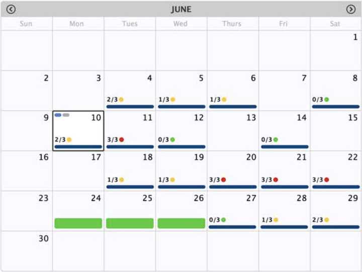
In mid-2018 I was tasked with creating a full-size calendar that users could use to select days or ranges of days. The calendar is for employees to request time off. This was the provided design:

Some explanation on the design elements:
- Looking at June 10th, the top-left of the cell contains colored “pills” for calendar events.
- The ratios (eg. 2/3) with colored circles beside them represents quota for the day (booked off / total allowed to book off).
- The blue bar at the bottom of the cell indicates the user is working on that day.
- Looking at June 24th, 25th, and 26th, the thick green bar indicates an approved vacation request.
Further information about the user’s selection is provided in a right-hand sidebar, not pictured.
Based on our estimations, the project had a tight timeline. We were trying to pilot this new module in late-2018, and there was a lot of front-end and back-end components required for the system. The calendar was the largest UI task, and thus one of the riskier parts of the project. This was also our first major module we were undertaking at the company with a UI driven primarily by React. The goal for the 2018 pilot was to build the minimum viable product to be used by a few hundred of our client’s employees and, assuming a successful pilot, be used by the client’s entire employee base (several thousand) come 2019.
Searching for a Solution
When solving problems the first thing I generally do is search through existing solutions/libraries to see if something fits all or part of the use case. Searching for calendar solutions proved annoying! On the web, the most popular form of calendar component is the date-picker. While the intent of this calendar was to pick a date (or date range) there was a lot of custom UI that needed to be rendered, per date-cell. This was around the time of the rise in popularity of render-props as a pattern (and the fall of high-order components for everything). What I wanted was a calendar that would let me implement a renderDay style render-prop.
Here are some of the libraries I ended up considering. WARNING: Some of my observations about these libraries might be out-of-date.
React Big Calendar 🔗
Seemingly the biggest player in terms of React full-size month calendars (with functionality beyond that of a date-picker). One of my biggest disappointments with this library was that the API I wanted to consume wasn’t what it provided. I wanted a renderDay prop (or something equivalent) to consume and it didn’t provide one. Instead the API it provided was a prop you could pass events into, where those events were what was rendered on the day-cells. One thing I eventually learned is tightening up the provided API in this way is likely what allows them to offer a relatively seamless developer experience for rendering events that span across multiple rendered cells in the calendar. Our design included no UI that spans multiple days.
After some thought and experimentation I realized this wouldn’t work for the use-case I had. Rather than just rendering events onto calendar days, I needed to render multiple different components styled in my own way.
React Dates 🔗
Airbnb’s excellent date-picker component. This was very clearly written with the date-picker paradigm in mind, but I was hopeful it would be flexible enough to be used as a full-sized calendar. The API provided by this library is expansive. It’s extremely functional, which made me hopeful it would work for my purposes. We were already using this component to render date-pickers in our application, so there’d be no major additional cost in learning a new library and shipping extra JS.
The library provides a storybook of examples. There are tons of example date-picker use-cases. There are few examples that line up closer with a full-size calendar with custom day contents: here’s an example of custom day contents and here’s an example of larger day cells being rendered.
After some experimentation I decided the library had too much date-picker overhead and the lack of examples on how to use the library as a full-size calendar were more than I wanted to overcome.
I continue to believe this is a great date-picker library. I also believe that you should not use this library to build a full-size calendar. I’d be very interested to learn if anybody has implemented a large calendar with this library.
RC Calendar 🔗
RC Calendar includes a number of components. I specifically looked at FullCalendar. In this example click the “month” option in the segmented control to see what I was looking at.
I found this calendar by following the trail from ant.design’s calendar. That calendar is here. This calendar aligned most closely with the API I wanted. It provided a dateCellRender prop! Unfortunately there was no way we could justify adding the Ant Design library just for this calendar! The process of adding ant design’s UI library is involved and the library provided way more than we wanted.
After browsing the ant design source code I realized they were using another underlying library, RC Calendar! So that’s how I found out about this option.
After some experimentation I determined this was the best option for the purposes of our pilot. It provided a render prop and allowed rendering arbitrary things onto the day cells, which is exactly what we needed.
Using RC Calendar
While RC Calendar provided the render-prop API I wanted to consume, it wasn’t quite everything I had dreamed of. I still ran into problems with controlling and handling the borders between cells and had to solve certain issues using CSS and marking things as important to override the underlying styling. I also hard-coded the width of the calendar to avoid resizing issues. The calendar did not have to be responsive for the pilot project, but it would need to be if the project continued into coming years.
This implementation was not as easy as I’d hoped. I did the implementation in 2018, so I can’t remember all the details, but I remember a lot of experimentation with overriding the libraries styles to make the calendar UI match as close to the design as possible.
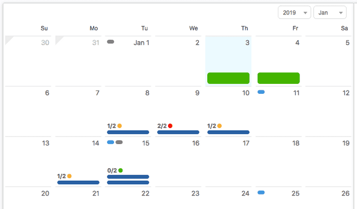
Here’s what that looked like:

There’s obvious differences between this and the original design. The year-month pager is the default RC Calendar pager. The cell selection UI is the default RC Calendar UI. Perhaps most obviously, the cells don’t have vertical borders between them. This border UI is controlled and managed too strictly by the library. Custom border styling proved too difficult to implement (I believe forking the library would have been necessary).
Despite the limitations I ran into with RC Calendar, I think it still has valid use-cases. It’s worth understanding that, despite providing a render-prop API, you may not have all the customization options you want. The library never fully gets out of your way. While RC Calendar isn’t perfect for building fully custom calendar UIs, it can be useful for creating a calendar that looks close to the RC Calendar default design, while allowing for some customizations.
Implementing React Clean Calendar
I wasn’t happy with the difficulty I had in implementing our intended calendar UI. During the entire implementation of this project my desire to write my own calendar library had been growing. My employer knew we’d have to do further calendar work in 2019, assuming the success of this project. Despite this, I decided to tackle the project on my own time. I’m always looking for reasonably scoped side-projects that I actually have a chance to ship. A calendar library seemed like a perfect candidate for a shippable product.
My vision was simple, I wanted to allow complete customization of all parts of a calendar’s UI, while providing a simple set of completely overridable defaults. I didn’t want my library to stand in the way of any UI customizations the library consumer wished to make. I intended to do this by providing render-props. The trade-off I was willing to make was shipping a library that was harder to get going with (providing limited production-ready styling).
Another project goal was to not make use of any third-party dependencies for the production build. At the time I created this library (and I think to this day) there is some concern about the explosion of dependencies most JavaScript projects contain. As an experiment I wanted to see if I could avoid any production dependencies. The most obvious limitation this presented was the need to use the default Date object in JavaScript rather than a library like moment or luxon.
Over the course of September and October of 2018 I wrote the core implementation of React Clean Calendar. Later on, in 2019, I spent more time working on the release process (I used rollup for the first time to ship a UMD build), writing documentation for the library, and creating a number of examples and recipes.
I consider the project feature complete and don’t have any current intentions of adding any more features. I think more feature-filled implementations could be built on top of this library, and some of my examples and recipes hint at that, but those ideas are not in-scope of this library.
The library is great for the use-case it was built for, it gives you complete control over how the calendar day cells are rendered. The library is intended to be used by someone who has a custom UI in mind (or wants complete control of the UI). The default UI implementations are not something I’d consider production ready.
The library does not provide the same conveniences for rendering multi-day events or UI like React Big Calendar. If you want to render an event on multiple days, you need to handle that in the render function for each of the cells that has part of the that UI. Lining items up across cells and having them connect would be completely up to you.
One major missing piece of this library is a thorough audit on its accessibility. While the day cell UI is driven by library consumers, the calendar should probably handle labelling calendar days and handling focus on the day cells.
Using React Clean Calendar in Production
My employer’s pilot project was successful. In 2019 we were tasked with improving the module, and the previously mentioned improvements to the calendar were on the table. In March of 2019 we replaced our RC Calendar implementation with React Clean Calendar.
Here’s what we gained:
- The new calendar was completely responsive. We even wrote a custom mobile UI for the day cells. This library made this trivial.
- The CSS and styling hacks we did to make RC Calendar work could be removed.
- We could more closely match the original intended design (or whatever future design we wanted).
- The footprint of the library is significantly smaller (granted this was not a major concern of ours).
Final UI
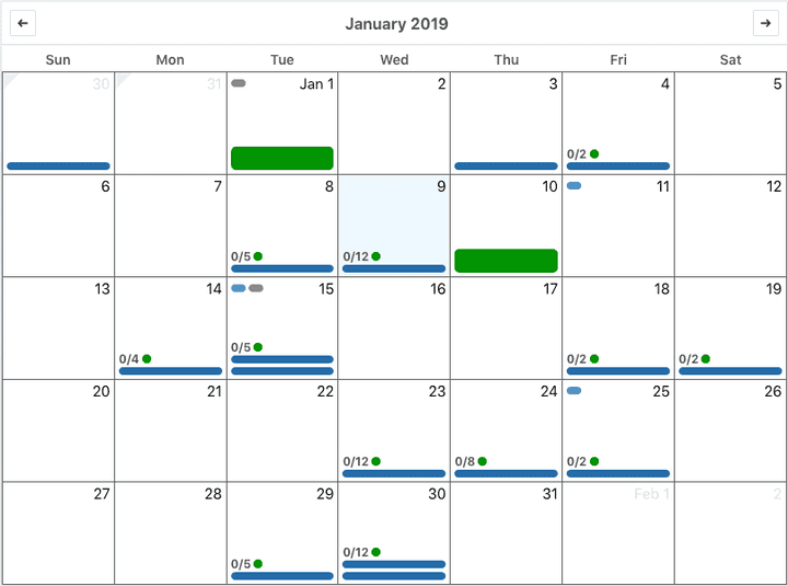
The final UI still doesn’t match our original design exactly. This time that was largely by choice. Having deployed the pilot project to clients, we kept some of the original UI for consistency’s sake and some of the differences were things we decided we preferred.
Here’s what it looks like:


Conclusion
Thousands of users have used React Clean Calendar to create tens-of-thousands of vacation requests in 2019. I think React Clean Calendar is a great place to start if you have a custom calendar design in mind.
React Clean Calendar:
Share this article: